Research and design to increase conversion rate for an app that helps people meet new friends
COMPANY OVERVIEW
A fictional startup has launched an app that helps people meet new friends and discover activities in their area.
The brief included information about the company’s brand attributes and target user.
Brand attributes:
Caring
Familiar
Humorous
Optimistic
Target user:
32-55 years old
Equal split between men and women
Use phones and desktop applications equally
Middle class

PROJECT SUMMARY
Stakeholders are concerned that, on average, only 20% of people who sign up for an event actually attend.
Business goal: Increase conversion rate.
Information from the Product Manager:
Users may not be getting effective communication about the upcoming events (emails, reminders, etc.)
Possibly users need an incentive to attend, but this incentive would need to be cost-effective for the company
TIMELINE
I had 80 hours over the course of 2 weeks to complete all phases of this solo project.
I started by estimating each task and deliverable.
Click on the timeline to enlarge.
COMPETITIVE ANALYSISIS
I researched Meetup, Eventbrite, and Facebook’s event functionality.
There were several things I decided to incorporate into my designs based on this analysis:
Link to full event info in email reminders and push notifications, which also allows user to cancel easily
Make it easy for the user to add the event to their calendar after signing up
Provide options for when reminder emails and push notifications are received

SECONDARY RESEARCH
Next I conducted secondary research to determine what strategies have been used to effectively increase event conversion rates.
Based on this research, I had several more ideas that I felt would improve the app.
Provide clear and complete information on location, parking, finding the group, etc. – anything that might make someone apprehensive to attend if they didn’t know
Include a unique URL in calendar invites, email reminders, and push notifications that opens full event info without log-in and allows registrants to easily message event organizer or cancel
Show who else has signed up for the event
Consider ways to reward guests for attendance
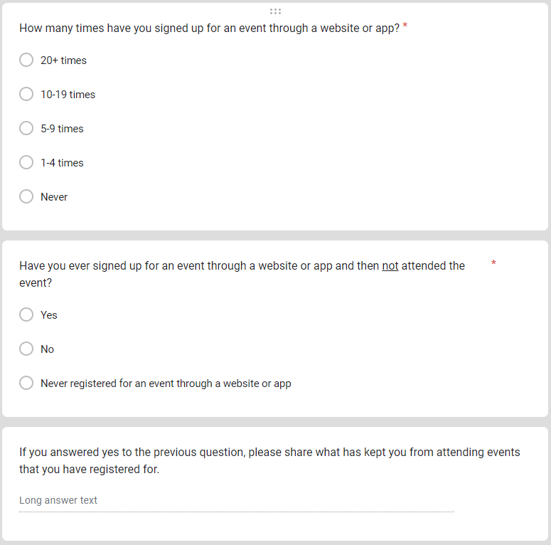
SURVEY
I also distributed a survey with a mix of quantitative and qualitative questions.
The quantitative questions aimed to identify potential participants for usability testing.
The qualitative questions were related to increasing attendance. The responses confirmed what I had found from my secondary research.
USER FLOWS
Based on what I learned from my research, I created user flows for 3 customer journeys that could affect conversion.
Click on the user flows to enlarge.
User Flow #1: Sign up for an event
User Flow #3: Modify notification settings
User Flow #2: Cancel an event
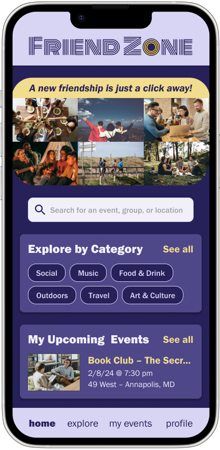
LOW-FIDELITY WIREFRAMES
I created wireframes for the 3 primary user flows to be used in my initial round of testing.
Click on the wireframes to enlarge.
GUERILLA TESTING
I tested my wireframes with 5 participants and uncovered several fundamental problems with the clarity of the UI.
Issues to address:
It was not obvious to participants that “Upcoming Events” were events the user had already signed up for.
More participants clicked on the “Edit Profile” button rather than the settings option when asked to modify their notification settings.
The toggles and “All” notifications wording were confusing to people.

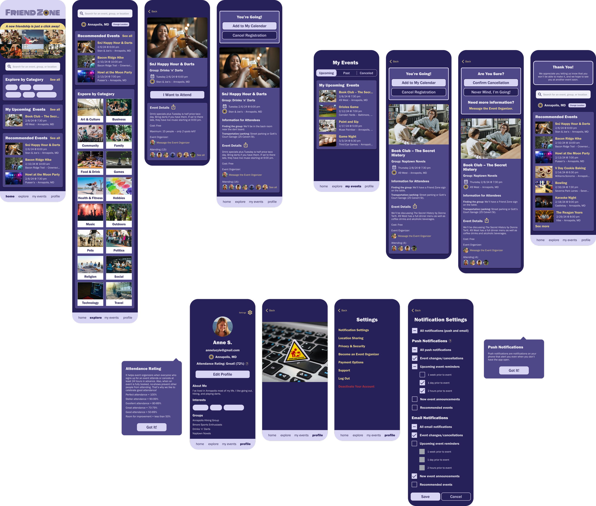
HIGH-FIDELITY PROTOTYPE
Armed with the lessons from my guerilla testing, I created a high-fidelity prototype in Figma.
Click on the prototype to open an interactive view in a new tab.
USABILITY TESTING
I conducted 5 remote moderated usability tests, and participants were asked to work through 4 scenarios. I then prioritized the issues I observed.
Task scenarios:
Find and sign up for an event without using search
Cancel an event
Modify notification settings
View a reminder push notification
Click on the table to enlarge.
ITERATION: WHAT & WHY
Based on the results of usability testing, I made the following modifications to my prototype.
Click on the screens to enlarge.
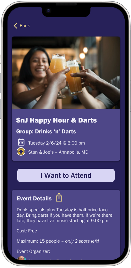
Event Details Screen
1 Added a share icon to the event details section so users can share an event even if they’re not ready to sign up.
2 Included the cost, even if free, so users wouldn’t have any uncertainty.
3 Added link to contact the event organizer in case the user has questions.
Event Registrant Screen
4 Changed “Change RSVP” button to “Cancel Registration” to avoid confusion.
Cancellation Screen
5 Modified wording on cancellation screen for clarity.
Notification Settings Screen
6 Added “(push and email)” for clarity. Also changed toggles to checkboxes because the indeterminate state better reflects the way the user can set the options.
7 Combined event changes with event cancellations to decrease the number of settings.
Reminder Push Notification
8 Removed details and replaced with a link that opens the app to the event details screen. Also included a link to cancel registration to make it easier for users.
OUTCOME & NEXT STEPS
Overall, participants responded positively to the prototype, but there are a few areas that require more research.
Participants had mixed feelings about the attendance rating. I would A/B test a percentage rating against a star rating, with a control of no attendance rating, to see if either has a statistically significant impact on conversion.
The company was open to providing incentives for users to attend events if it was cost-effective for the company. However, given the number of changes to implement that won’t incur ongoing costs, I would measure the results before moving forward with anything that would incur ongoing costs.
Some of the strategies employed to increase conversion will create extra work for event organizers. I would conduct user interviews with event organizers to ensure that changes will not negatively impact their experience or prevent them from hosting events.